An approach to simple and stress-free air travel booking.
Mobirise Website Builder

Overview

  • Project duration
    5 months 
  • My role
    UX Designer
  • The product
    As a result of my journey with UXDI I designed the user experience of booking a flight for a fictitious airline's website
  • Objective
    The goal of this project was to solve the current usability issues that are present in most common airline websites on the market.
  • The outcome
    From a business perspective, the airline website has to reach global conversion rate for airline companies.

    From the user point of view, the interaction has to be calm, easy to understand and not overwhelming.

Airline Website Prototype Video

Booking a flight can often be a frustrating experience: confusing navigation, endless steps, and unexpected surprises at checkout.I set out to change that by designing a seamless, user-friendly airline booking process. From uncovering user pain points through research to crafting intuitive prototypes and validating them with usability testing, I tackled these challenges head-on.

The result? A design that not only simplifies the booking journey but also aligns with business goals to deliver value for both users and the company.

The process

The Challenge

My fictitious client is a start-up low-cost airline. They’re looking to create an online experience that is fast, easy and intuitive: one that’s based on a deep understanding of their target users.

 The industry is packed with airline websites designed poorly. As a result, users find the process daunting, worry about making mistakes and busy with ads.

One of the challenges is to create a website that is familiar to our users without the hustle, but serves the needs of our start-up.

I will focus specifically on the flight booking process: how users search for and select flights online.

What others are doing

Competitive Benchmarking

This process allowed me to understand the competitive landscape of airline companies, identifying effective practices, pain points, and current standards.

Mobirise Website Builder

Key takeaways

  • Established Design Conventions
    Most websites used standard conventions for search, selection, and booking stages. While the search process was generally easy to follow, the flight selection and booking stages were more complex.
  • Strengths to Emulate
    Features that improved user experience included uncluttered pages, prominent search boxes, progress bars, and rapid search result updates.
  • Areas for Improvement
    Highlighted flaws or pain points in user experience such as: cluttered interface, confusing fares or unnecessary steps during flight selection), ensuring these were avoided in my design.
Mobirise Website Builder

Slide of Competitive Benchmarking - KLM

Quantifying user decisions

Survey

In this short quantitative research, I aimed to identify users' main goals and needs when visiting an airline website and test my assumptions:

- Users prefer travel aggregators to search for flights.
- Users get lost with all the irrelevant information and lack of structured steps when booking a flight

*The survey was answered by 15 participants in total, so the findings represent a small sample size and can not fully generalise to the broader user base.

    In total 15 participants responded and these were the main insights

    The main reasons for visiting an airline website were to check-in or book a flight


    My assumptions were confirmed:

    - Nearly 27% of participants find the navigation on airline websites confusing
    - 74% said their favourite airline website for booking flights is Sky-scanner  


Mobirise Website Builder

Key takeaways

  • 01 
    Vast majority prefer fewer ads / extra services.
  • 02 
    Users often find the payment process and navigation confusing.
  • 03 
    A significant amount of users indicated it took a “Little more time” than they expected to complete their task.
  • 04 
    The majority answered Skyscanner is their favourite airline website.

Gaining first-hand insights

Usability testing

I conducted 3 usability tests to acquire deeper insights on the thinking process of a user planning and booking a trip. I used a scenario for testing two of the websites I had already benchmarked. The test subjects were both young professionals living in the Netherlands that book flights occasionally (target audience).

  • Crafted a comprehensive interview and usability testing script tailored to the context of airline website usage. Sample questions included: "When did you last book a trip?", "How many travelers?", and "Where did you access the website?"
  • Developed user-centric tasks to explore participant behaviors, goals, emotions, and mental models while interacting with the platform.
  • Adapted tasks during testing to address multiple user goals, such as researching popular use cases from survey responses (e.g., "checking offers" and "planning multi-destination trips").

Key takeaways

  • Users stressed that some actions took more time than expected and were annoyed about losing time.

    e.g choosing a return date and then realising that there are no flights available on that date.
  • Users felt in charge of their actions when having clear options, and no misleading information while booking.
  • Not having straightforward information or having to search for it caused significant problems for the user.

From messy to organised data

Affinity Diagram


After collecting the data, I used an affinity diagram to organize and analyze the information.

I set up a remote Miro session with one colleague to process the material. 

Together, we made concise annotations for each stage of the user booking experience by reviewing notes from benchmarking and usability tests.

Understanding the narrative

Customer Journey Map


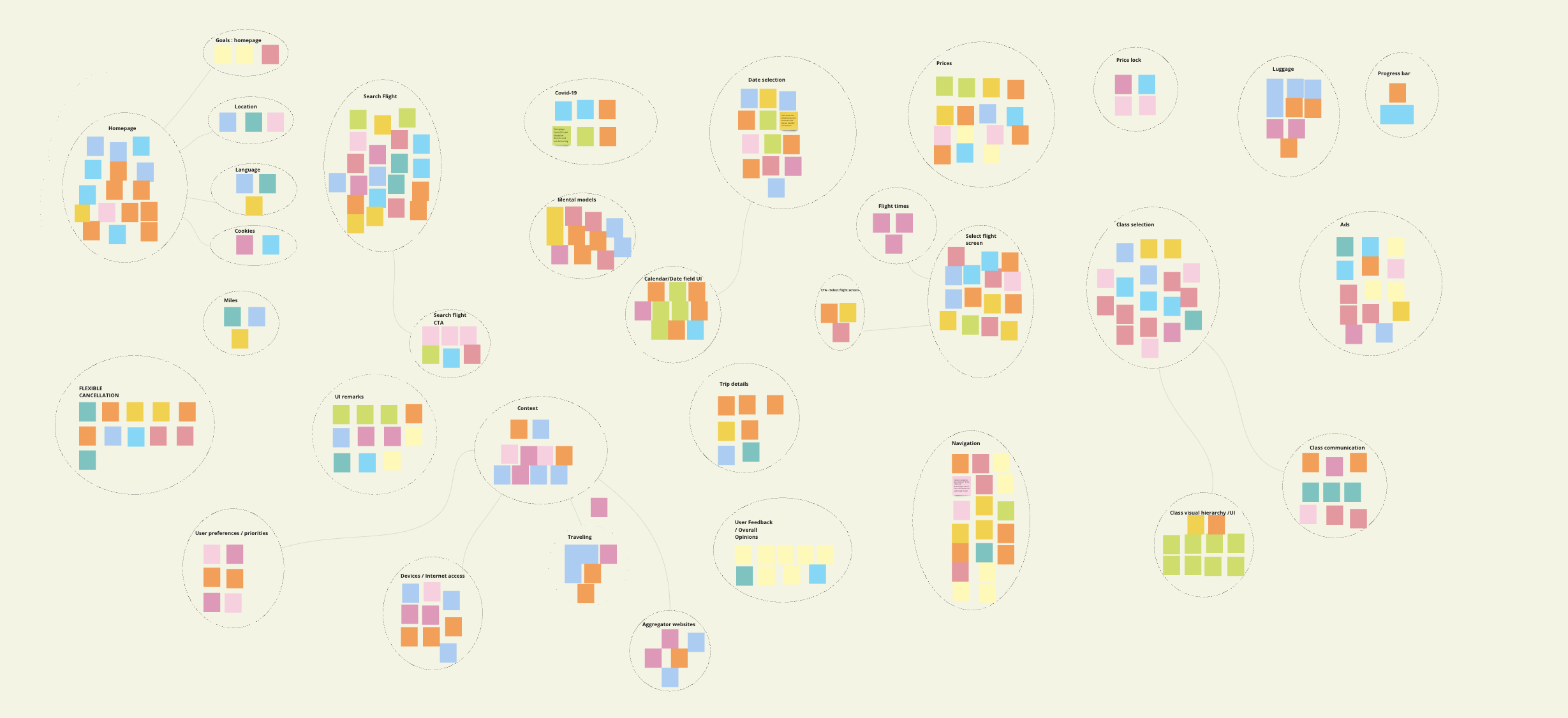
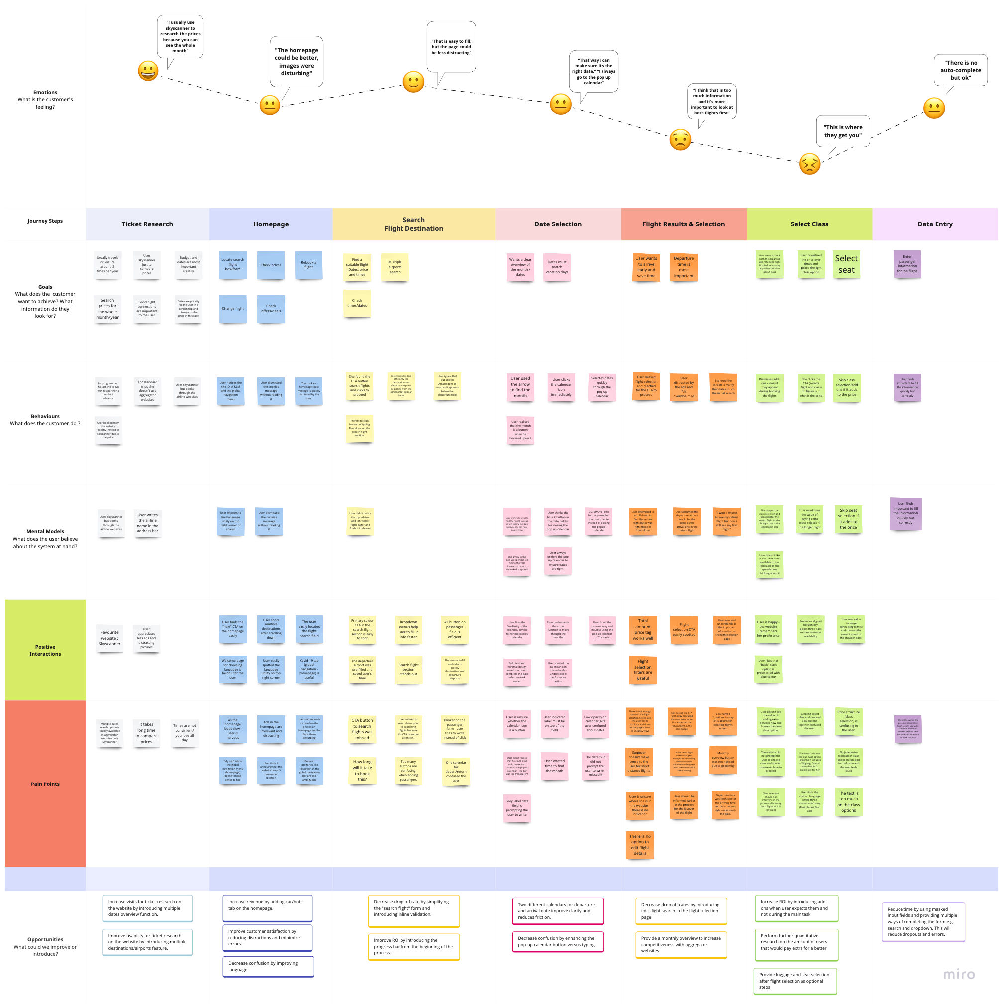
Building on the Affinity Diagram, I created a Customer Journey map to capture the user experience of planning and booking a flight.

Using Miro, I documented goals, behaviours, positive reactions, pain points, and mental models at each stage. This process highlighted problem areas and helped guide the design of effective solutions.


From messy to structured data

User Flow Diagram

I visualized user movements by mapping each screen of the booking process, focusing on high-level user flows for searching, selecting flights, and filling out forms with personal details . After iterating on paper, I digitized the flow in Figma.

Key Solutions

  • Clear, concise screens for selecting origin/destination airports, travel dates, and number of travelers, reducing the steps needed before viewing flight results.
  • A progress bar to indicate the user's current step and remaining steps in the process
  • Simple, uncluttered screens with a consistent UI to maintain user focus and prevent confusion.
    Every story starts with pen and paper


    Rapid Paper Prototyping

    Sketching allowed me to visualize the screens and features derived from user research. I began with high-level navigation sketches, then refined the most promising ideas and developed detailed screens and interactions for the core flow.

    Rapid iteration with paper prototype allowed me to test layouts and workflows quickly, making necessary adjustments to better meet user needs.

    Note
    Before digitising, I conducted a usability test with the sketches. Although there was some initial awkwardness, users shared valuable feedback by indicating where they'd click, which helped me iterate the design effectively.

    Mobirise Website Builder
    Bringing sketches to life!


    Medium Fidelity Prototype

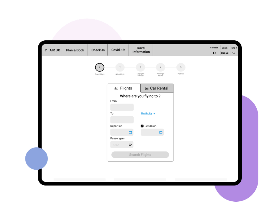
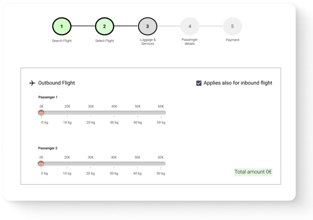
    Designed a medium-fidelity prototype in Figma, incorporating interactive elements such as input fields, airport selection, and passenger count to test core interactions efficiently and cost-effectively.

    Balanced user goals and business needs by integrating selling points like “offers” and “additional services” while minimizing distractions in the main user journey.

    Mobirise Website Builder
    Instructions to launch


    Development Handover

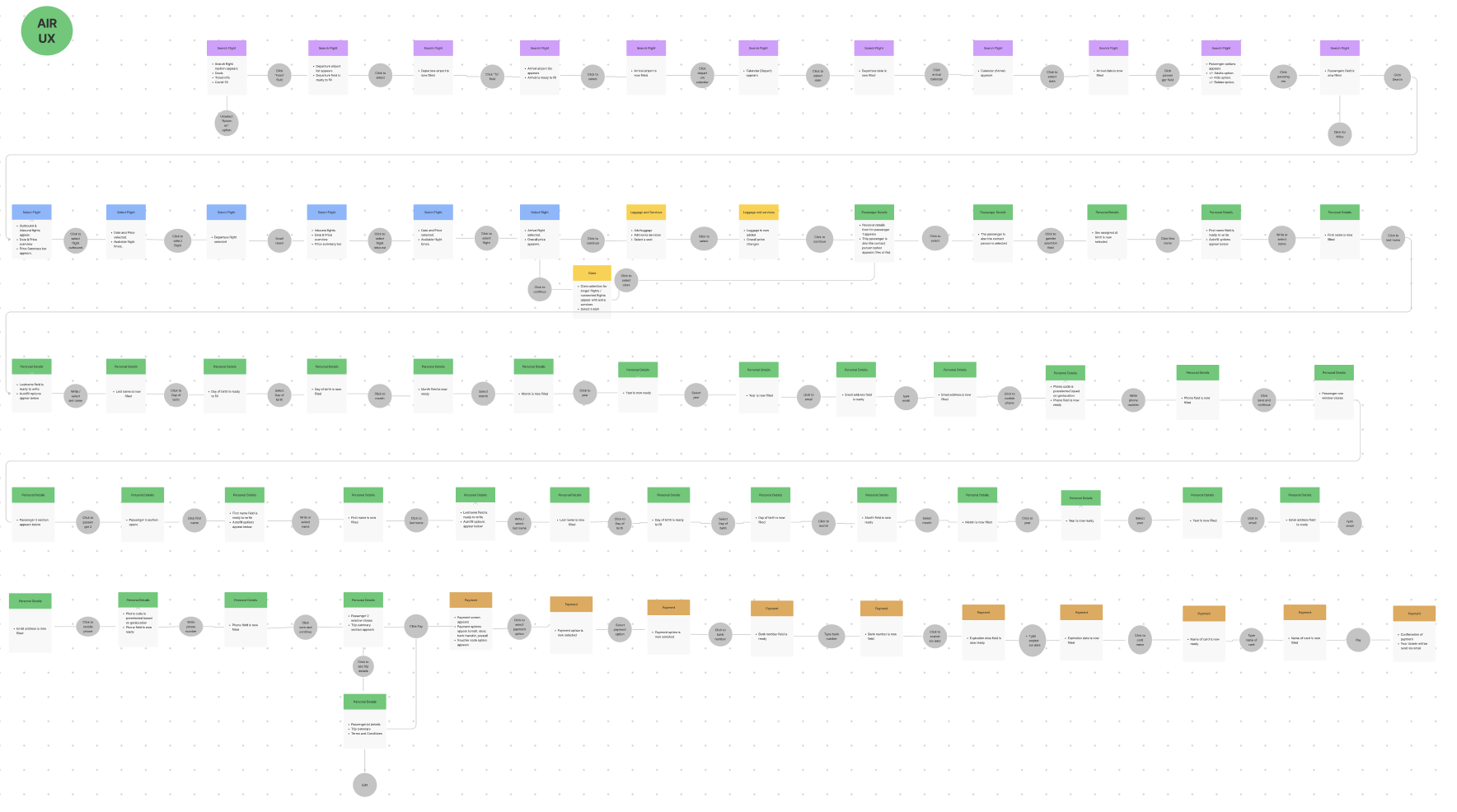
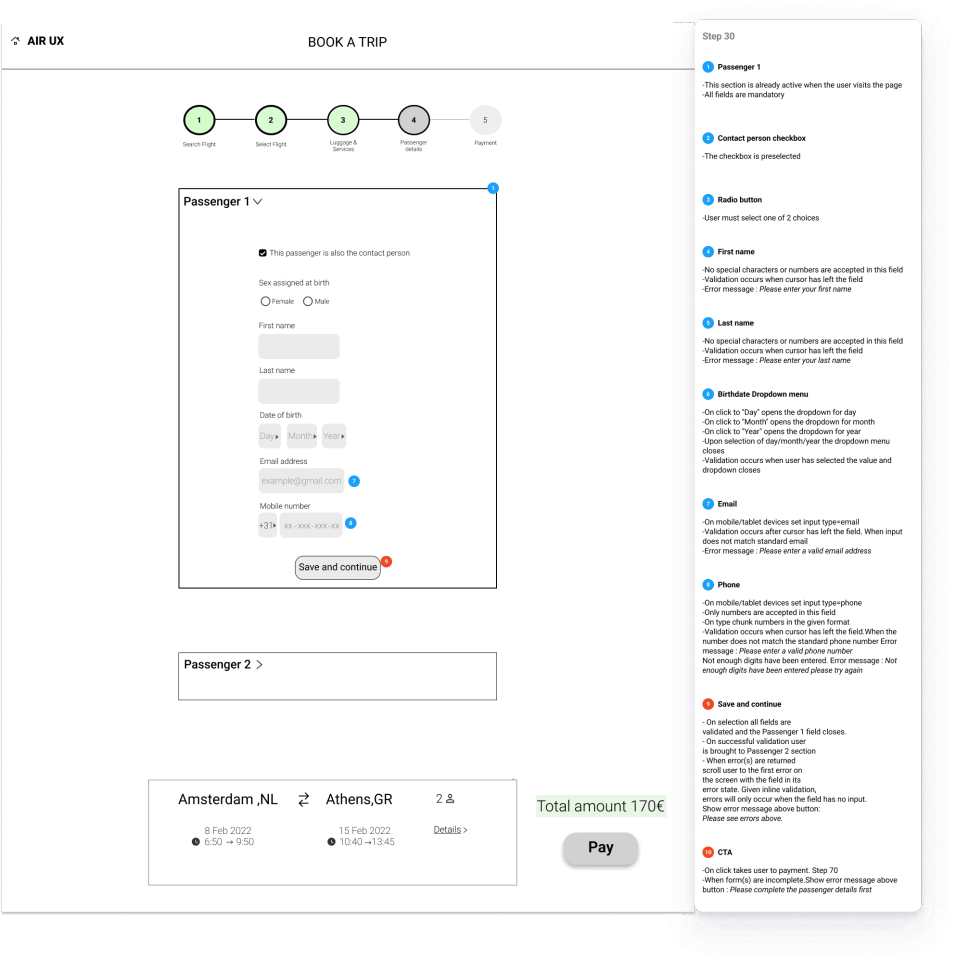
    The final step was to create a detailed document for developers.

    I used Figma to define the functionality and design of each element and interaction in the prototype, making sure the wireframes included all essential details for precise development.

    Mobirise Website Builder

    Iterations and learnings

    Usability testing

    After testing the new solution with three users, I refined the design based on their feedback, making targeted improvements to enhance usability and clarity.

    Key takeaways

    Slider Control
    • Users found the slider confusing when selecting luggage. Sliders are also not responsive-friendly.

    • Replaced the slider with a stepper control, making it more intuitive and reducing task time and errors.

    Label Clarity:
    • Users found the term "Outbound Flight" unclear.

    • Replaced it with "Departing Flight" for better clarity and understanding.

    Distracting Images:
    • Users found the images on the left and right of the flight search container distracting.

    • Removed these images and kept the ads and cross-promotions below the form to maintain focus on the search experience.

    Mobirise Website Builder

    After

    Mobirise Website Builder

    Before

    Conclusion and next steps

    This case study let me apply my UX Design Institute training and transform user frustrations into a seamless solution. I enjoyed the hands-on process of usability testing and bringing a product to life.

    I’m excited to explore more flight booking scenarios and further refine the design through testing .

    • A cup of tea
      with Thea?
    • About me
      Thea is a UX Designer & Researcher with a background in Social Anthropology. She is the happiest when she looks at the world through people's eyes to build delightful products.

    Social